Field Trips: The Art of Mary Heilmann
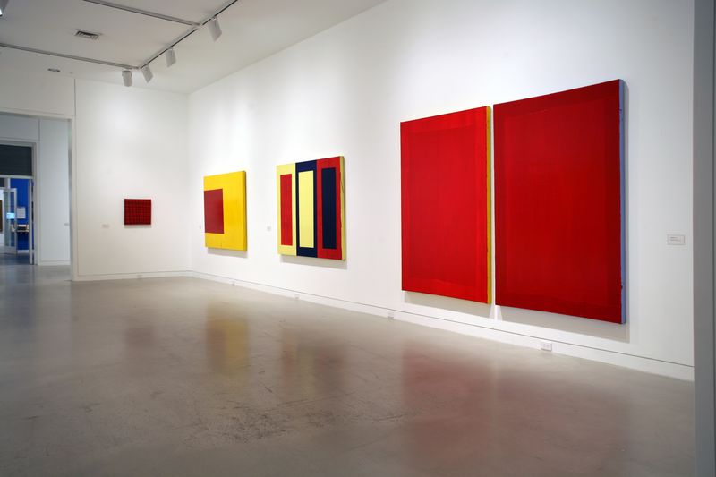
Installation view, 'Mary Heilmann: To Be Someone', Orange County Museum, Newport Beach CA. © Mary Heilmann
Field Trips: The Art of Mary Heilmann
If Mary Heilmann is now mostly known as a painter’s painter, her current retrospective, which inaugurated its four-city tour last spring at the Orange County Museum of Art, makes it clear that this ought to change.
She is the author of too many smart and gorgeous images to let the artists keep her to themselves. But this isn’t all that needs fixing. As the retrospective emphatically demonstrates, a new chapter urgently needs writing in the still-inconclusive history of postwar abstraction – its highs and its lows.
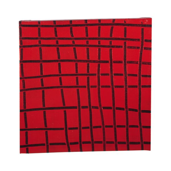
Mary Heilmann, Little 9 x 9, 1973 © Mary Heilmann. Courtesy the artist, Hauser & Wirth and 303 Gallery, New York
And I do mean lows: By 1969, when Heilmann, who had arrived in New York after receiving her MFA at the University of California, Berkeley, turned from object making to painting, New York–based abstraction was slowly sinking into a worn-out slump.
Clement Greenberg’s hegemony was beginning to unravel, and the artists he patronized would soon feel the pinch. Frank Stella’s salad days were behind him. Agnes Martin had left the city. Mark Rothko’s suicide was imminent. Robert Ryman and Ellsworth Kelly were both working steadily, granted, but so distinctively as to be inimitable by younger artists – not that Heilmann seems to have ever resorted to simple mimicry, despite the frequency with which other artists of her generation have used it as a tool. Instead she relied on coming to terms, as all serious abstractionists must, with the most basic issues art presents.
What world can a painting summon? What does it offer to the mind and senses? Should it aim to disclose the contingencies of its making, or strive for an effect of presence so complete, so vivid, as to seem foreordained? Or is the point to erode the inevitable barrier between the viewer’s present and the painter’s past, between the now of looking and the then of making? The great benefit of operating within abstraction, of course, is that its self-imposed limits thrust such questions to the fore. Color and surface and pattern, mark and system and grid: Like all the successful abstract painters before and (hopefully) after her, these are constants Heilmann varies, and thereby reinvents.
Sometimes a little urban isolation can be beneficial if reinvention is the goal. There’s no one around to mention that being a painter in the age of information is not exactly going with the flow. Or if anyone told Heilmann, it was advice she chose to ignore. Instead, from 1970 onward, she focused on devising the means for her own post-Minimalism, absorbing and loosening the ancestral geometries, untucking their shirttails, rolling up their sleeves. Consider her way with the grid. ‘Little 9 x 9,’ 1973, is a perfect case in point. This small square acrylic takes its title from the eighteen thickish lines that plow through it, nine to a side. I say plow because the red paint has been laid on generously, then scraped away to show a substrate of black. But if Kazimir Malevich would have approved of this color scheme – and likewise of the equilateral format – he would have had no time at all for these offhand marks and halfhearted grid. There are no right angles in this antisystem and no team players either. All Heilmann’s lines seem to do in concert is take a jab at geometry, with a follow-up swipe at the square. What is striking about ‘Little 9 x 9,’ however, is that none of this (the unsteady intersections, the wonky waverings) is casual in the least.
Heilmann’s apparently improvised grid is actually exactingly constructed to make a weave or web. Its lines go over and under one another, starting and stopping with a deftness that speaks of intention and perfect (yes, the word is justified) control. How can you tell? Because the artist worked with the thick red layer when it was still wet, which means that the lines she scraped into it have raised edges: Think again of the passage of a plow. And each line starts or stops on a dime, either overriding or conceding the next. The result means everything for how the painting looks and feels. Grid becomes web, and that web is amazingly alive. There are two more things to be noticed about ‘Little 9 x 9.’ (This wealth of nuance in itself is quite striking, given that the painting is one of Heilmann’s smallest, not quite two feet square.) First is the fact that the ground and lines wrap around the stretcher, in denial of painting’s famous fictive edge.
Heilmann was of course not the first to extend an image in this manner, but over the decades the device is one she has used consistently, maybe insistently. Why? To paint the stretcher edge is always to call attention to the picture as an object. This principle, indelibly impressed upon us in the 1960s, is not something likely to be forgotten, but still, nothing says it must be so assertively espoused. Each time Heilmann does so, it’s as if the painting’s objecthood needs reaffirming, even reasserting, to defuse the absorbed deciphering her work demands. In other words, her painted edges are a way of bringing her viewer back to earth, the province of painting-as-thing. Lastly, still thinking about ‘Little 9 x 9,’ there is the matter of its date: thirty-four years ago.
Heilmann was then thirty-three. A San Francisco native, she had studied literature and poetry before taking up ceramics and sculpture. (She received her MA from Berkeley in 1967.) She had moved from one coast to another, as well as from one discipline to another, and had made a place for herself in a New York art world that at first had mostly turned its back. All of which is to say that in 1973 she was no precocious youngster, but someone who had discovered a set of principles, a mode of production, an approach to making art. Her painting does not so much have a style as offer a certain kind of experience – an experience that Little 9 x 9 encapsulates but doesn’t programmatically define.
There are too many contrasts in Heilmann’s work for that to be the case. And this single painting alone cannot convey what the retrospective in its entirety demonstrates – which is that over the decades, it hasn’t always been easy for Heilmann to discover how to expand or redirect the experiences her works permit. What possibilities lie beyond the deconstruction of geometry? Is organicism a viable option? What about the possibilities of the palette? For nearly ten years the artist stuck mostly to the primaries, along with black, gray, an occasional ocher, now and again bright pink.
By the ’80s all this, and more, had started to change. One painting that marks a definitive new direction is ‘Rosebud,’ 1983. Though I am normally not much given to such statements, I am tempted to call this painting Heilmann’s masterpiece, her chef d’oeuvre: Why not go the whole nine yards? Or if this verdict seems to slight too many of her other pictures, I’ll just say that ‘Rosebud’ shows the artist at her best. And its beauties should be seen in the flesh. Few other canvases are so subtly an issue of surfaces and depths.
Surfaces, in the plural, because the white field and blood red… what?… splotches?… are so distinctly textured and different in look. To speak of the whiteness first: It is matte, a bit dry, not particularly brush-marked yet still far from smooth, its expanse registering quasi-seismic changes in whatever lies below. The signs are everywhere, in pinkish pentimenti and a telltale pattern of cracks. At least one layer of red has been covered; in many places, the white is a whiting-out. The shiny scarlet orbs that remain, by contrast, are slightly, very slightly, raised patches within the sea of white. They seem to have been daubed on quite wet. Witness both the drips that course down from their edges, and the wrinkled texture that often results when the top layer of a paint pool dries in advance of its depths.
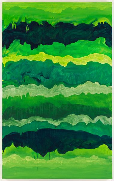
Mary Heilmann, Winter Surf, San Francisco, 2006 © Mary Heilmann. Courtesy the artist, Hauser & Wirth and 303 Gallery, New York
These sorts of ‘accidents’ are common in the work of Jackson Pollock, who both ‘denied’ and mined them – the two are one and the same. Pollock, in other words, rather deliberately allowed each pour and flick and puddle to take its wayward course. The chips fall where they may. Heilmann does this as well, especially in Rosebud, which evokes Pollock’s delicate violence in dripping scarlet paint. Each shape mingles pleasure and pain. The red orbs are not simply splotches but vessels and flowers and organs and emptied balloons. They are the shriveled breast of a withered beauty and a clown’s flattened nose. And they are the artist’s bloody projectiles, hurled hard, then left to dribble, congeal, and dry. Not much denial here. At this juncture it should be said that not all of Heilmann’s paintings reach this level of intensity. Nor do they all aim to. Not all of her work is so bodily, for a start.
Many paintings are interested in rudimentary systems – the aforementioned grid, for example, or horizontal stripes, or a surface web of lines – and since the mid-’80s, two or even three such schemata may be combined in a single work. Some paintings concern themselves with space in the abstract while still others – ‘Capistrano' and ‘Miramar,’ to mention two from 1994 – remember her California childhood in their (rather trite, alas) treatment of ocean and sky. And various artists likewise haunt her work’s different formats, not just Pollock, but also Jasper Johns in his ’70s incarnation (this Johns is, I think, a particular and not always healthy passion), Joan Mitchell (whom Heilmann admits to ‘quoting’), and Piet Mondrian. Mondrian is the benign deity behind a number of paintings that date from the later ’70s and that were installed as a group at the Orange County Museum. Again, the titles are as evocative as the works, with their nested primary-colored parallelograms, are spatially suggestive: ‘French Screen’; ‘The Rosetta Stone II’; ‘Red, Yellow and Blue Knot.’
In his essay for the show’s catalogue, Dave Hickey declares that these are ‘1950s-type evocative titles.’ This is not meant as a complaint, mind you, just as one observation among many the critic offers about a painter he knows and admires. But why limit ‘evocative’ titles to the ’50s? From Mondrian’s ‘Broadway Boogie Woogie,’ 1942–43, to Stella’s ‘Die Fahne Hoch!,’ 1959, to Jay DeFeo’s ‘Rose,’ 1958–66, to Eva Hesse’s ‘Contingent,’ 1969, abstract artists have used such magic bullets to catalyze what are often crucial explosions of sensation and response. Not every one of Heilmann’s titles opens this kind of traffic, but any artist who includes ‘the Rosetta Stone’ among her chosen phrases clearly aims to make the interplay of word and image fundamental to how viewers grasp the scope of her work.
Woe betide anyone who fails to obey the instructions that Heilmann’s titles issue. Do not neglect to take the time to locate the squares in a painting that has been christened Blue and White Squares (it’s not all that obvious). And, looking at the many layers of Rosebud, do not forget to summon Orson Welles playing Charles Foster Kane gasping out his final word: With ‘rosebud,’ the quest begins (and ends). And be sure to open your ears to the echo of Barnett Newman’s famous question in ‘Red, Yellow and Blue Knot’ and to smile at the tense bravado of the negative lurking in ‘knot.’ Who’s afraid of red, yellow, and blue? Not Heilmann! For her, not being afraid means taking Newman’s title colors and making them hers. She does things with them that he not only never thought of, but also would have ruled far out of bounds.
Newman’s space and depth can be only virtual, ephemeral, while Heilmann, by contrast, makes these dimensions both layered and literal, building an almost visceral need to sense their physical traces into the time demanded for the making and seeing of her work. Or put somewhat differently: Heilmann’s paintings accrue their features – depth, color, volume, substance – over time, in steps or layers, whereas in Newman’s work, that process of accrual, or indeed, any process at all, is effaced or sublimated. His sublimity requires virtuality, whereas Heilmann, to repeat, seldom asks us to leave the world behind. Or at least not for long. If some of this is what makes Heilmann a painter’s painter, then so be it. She is also a painter for anyone who has paid attention to the art of the century so recently behind us and who has wondered how and whether painting will manage to keep itself afloat in the century to come. That this seems to be Heilmann’s own chosen question should come as no surprise. Will there be lyricism and immediacy and tragedy in painting? How about humor? Can standing still before a few yards of canvas continue to seem like a worthwhile thing to do? When you come across Heilmann’s work, even – or especially – amid the office parks of Orange County, you can only conclude that the answer is yes.
Does it really matter where one encounters Heilmann’s paintings? My point is not that the office parks in question are somehow blander or more uniform than their equivalents elsewhere, but rather that Heilmann’s work does indeed manage to convey feelings and sensations (her chosen antidotes to homogeneity and ‘information’) otherwise in short supply. One need only look at her most recent paintings to find confirmation of this.
Over the last few years, starting in the later ’90s and with increasing momentum in the past three years or so, she has produced a collection of intensely vivid canvases that, although they use familiar formats, are less layered and coded than her earlier paintings – they are bursting, instead, with a different sort of force. These works are funnier, more purely pleasurable, than anything she has done before, not least because now they wear their passions on their sleeve. To give one example, the familiar horizontal stripes are now loose and messy, and they have been stacked – as in ‘Winter Surf, San Francisco,’ 2006, or ‘Surfing on Acid,’ 2005 – to make thick wet Dagwoods of color. And these colors now look themed: cool and turbulent in one case, hot and hallucinatory in the other. In either case, the result is a trip. But this is not all. Also from 2005 is the great Jack of Hearts: a black-and-white checkerboard over which looms a comical Casper – a blood red specter of a shape capable of turning the once stably balanced grid into an endlessly fluctuating play of figure and ground. Or lastly, take ‘Sea of Joy,’ 2006. It is hard to find any k/not in this title.
As so often in Heilmann, feeling arises from the interplay of color and shape. And what a shape! Surely this hybrid (two squares joined together) is the format the artist has long been looking for, a geometry both more and less than a whole. What better field on which to stage a swirling counterpoint of color: soft gray, brilliant red, grass green. Behind or around these hues lie both black and blue. In the ebb and flow of color is Heilmann’s joyful sea: endless, exuberant, contradictory, dangerous – what more do you want? Only a history of abstraction in which her painting has plenty of room of its own.

Mary Heilmann, Sea of Joy, 2006 © Mary Heilmann. Courtesy the artist, Hauser & Wirth and 303 Gallery, New York
Related News


1 / 5