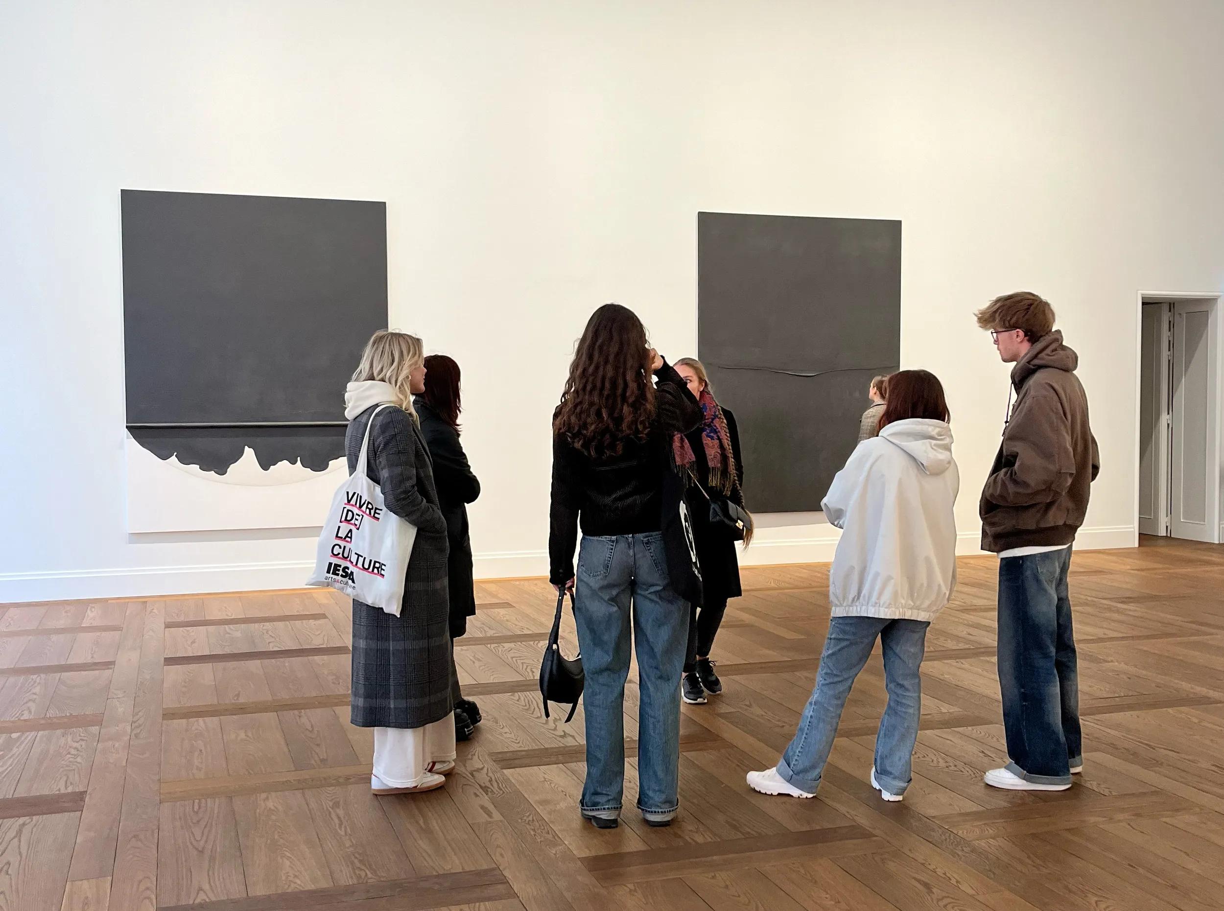
Ian Wallace, 'Clayoquat Protest (August 9, 1993) IX', 1993 – 5
Ian Wallace pressed the shutter release five times and placed the black and white prints in a vertical row of horizontal forms entitled Street Reflections (1970/2007). The eye takes a moment to realize that the street is on the left, the window on the right. Over the height of the five images, the recurring line of the pane of glass forms a broken zigzag; as a result, the boundary where reflection and reality meet, the focus of the composition, becomes dramatically visible.
This playful reconceptualization of a straightforward series of photos can be understood as a key to the artistic work of Ian Wallace. Coming from street photography, Wallace, who was born in the UK but lives in Canada, was at the spearhead of Canadian Conceptual art and a central figure in Vancouver’s post-conceptual photography movement. At the University of British Columbia, his students in the late 1970s included Rodney Graham and Jeff Wall – his juniors by just six and three years respectively. At the end of the 1970s, Wallace, Graham and Wall played in the New Wave band U–J3RK5 (pronounced ‘you jerk’). Later, Wallace taught at the Emily Carr Institute of Art and Design, where his students included Roy Arden and Stan Douglas. In the Dusseldorf show, Street Reflections hangs in the immediate vicinity of another series of black and white photographs, ‘My Heroes In The Street’ (1986). The almost-clinical appearance of these portraits of passers-by is accentuated by the broad white bands on either side of the image, which recur as a characteristic formal element of Wallace’s reduced Conceptual style. The randomness suggested by the casual composition is undermined by these white areas, which reinforce the dynamic of the subject’s movement.
As it turns out, the ‘heroes’ Wallace focuses on are not random strangers, but fellow Vancouver artists and friends. This minimal, well-placed intervention of white bands counters any sense of arbitrariness, they make the moment precious. Although the three closely co-ordinated exhibitions in Dusseldorf, Rotterdam and Zurich concentrate on different areas of Wallace’s oeuvre, the artist’s use of dry, analytical, structuralist collage stands out as a connecting element. In the Dusseldorf installation, one work from the ‘At the Crosswalk’ series (1988–ongoing) shows a woman and a man standing at either side of the road. Their full-length portraits are separated not by the street but by monochrome painted canvases.
The photographs are applied to canvases of exactly the same size, so that the whole forms a regular rectangular – an unmediated encounter between photography and painting. On the woman’s side, the painted canvas is dark green, almost black; on the man’s, it is bright red. Red and black were the preferred colours of both De Stijl and Russian Suprematism, representing in the latter information (black) and signal (red). In spite of its formal clarity, the situation in Wallace’s work remains unresolved. The relationship between the figures – who appear decisively separated, but who the viewer might wish, perhaps rashly, to link – is questionable: did this shared pictorial space and time, which the composition lays out before us like a stage, ever actually exist? Are the two figures related to each other in anything more than a random way?
As in the My Heroes in the Street images, which recall paparazzi shots, the people who posed at the roadside for Wallace were fellow artists, including Douglas, Graham, Wendy Elliot and Arni Runar Haraldsson. Whereas John Heartfield used newspaper pictures and typography to assemble ironic, exaggerated allegories, and Man Ray dreamed a violin onto a nude model’s bare back in in the darkroom (Ingres’ Violin, 1924), in Wallace’s work, rather than taking control of pictorial space, photo-collage contextualizes it. This is the approach adopted in The Idea of the University I – XVI (1990), a series of apparently documentary colour photographs, loosely recalling campus situations, lined up as a long sequence, interrupted by orange, purple, white and green monochrome strips. Installed in the spacious environs of Witte de With, the panorama of 16 panels, each 152 cm wide, remains visibly composite. Nevertheless, one can imagine that in a more cramped setting the viewer would not be able to take the work in as a whole, only as a succession of individual moments.
The 12-part photo-painting panorama Lookout (1979), based on 12 black and white images of a coastal landscape, introduces a different technique. Contact sheets and sketches on display at Witte de With show how Wallace asked people to adopt specific poses before inserting them into the original images and painting the entire work in tones that imitated photographic hand-tinting. Perhaps, then, Wallace’s lined-up fields of image and colour are best understood in the context of film montage. While collage builds up a picture layer by layer, cinematic montage can be understood as an extended, serial collage.
There are works by Wallace that appear conceptually stoical and cool, like the videos and photographs in his ‘At Work’ series (1983–ongoing) – frontal views of the artist reading in his studio were presented as a DVD loop in Zurich. Overall, however, it is Wallace’s persistent fondness for his own avant-garde art scene, his enthusiasm for Nouvelle Vague cinematic motifs, and the quality and density of his semantically over-encoded surfaces that add up to the quality that sets him apart – and with him the Vancouver School – from the many conceptualisms of the 1970s and ’80s. This quality is perfectly encapsulated in The Summer Script I & II (1974), a sequence of photographs, begun with Graham and Wall, which develops out of a halting succession of panels that are apparently hand-tinted.
Considerately installed within the symmetrical architectural surroundings of Witte de With, the work provides a revealing contrast with ‘The Idea of the University’. In The Summer Script I & II, a number of figures set in profile against a grassy backdrop are paired with the cropped corner of a garden table, brightly coloured fabric patterns and a vase of flowers, creating a moment that is charged with both the vanitas elements of classical still life painting and the cheerful humming of bees.