Profiles
A Brief History of Georg Kremer’s Quiet Revolution in Color
By Rebecca Bengal

Harvey Quaytman, Dr. Kremer's Magic Powders, 1993. Courtesy Harvey Quaytman Trust, Van Doren Waxter, NY, Blum & Poe, LA
On an early September afternoon, Jack Whitten’s studio in Woodside, Queens, is much as he left it just before his death in January 2018, at the age of 78—a place teeming with experiments, the place where he worked obsessively seven days a week. On his worktable, a dozen jars of brushes and pencils remain at the ready, overseen by a tall bulletin board densely collaged with a lifetime of photographs of loved ones, masks, postcards and ephemera. Framed photos of Whitten wearing an electric blue jacket and accepting a National Medal of the Arts from President Obama in 2016 still cause ConEd workers to stop and stare when they come to make repairs. Whitten was known to embed unusual material in his paintings—hair, ash, copper, eggshells—or to layer acrylic paint on thickly, as in some of his most famous works, the Black Monolith paintings, dedicated to significant African-American figures. ‘There’s Frederick Douglass,’ said Mirsini Amidon, Whitten’s daughter and studio manager, indicating one canvas. ‘There were four more new ones he was planning…’ She trailed off.
Among the finished works in the studio is a series of eight abstract paintings in pearlescent metallic colors that appear practically liquid. Whitten called the series Elemental Matter. They resemble a mysterious, circular piece of mixed media, encased in plastic, that Whitten left on his worktable: a pliable three-dimensional material that looks like a cross between the shapes on the paintings and a rolled-out pizza dough dipped in iridescent paint. Depending where you stand, the color of the object shifts from silvery green to pearl, with multiple variations in between. ‘We’re not sure what that one was going to be,’ Amidon told me. ‘It was one of the many mysteries Dad left behind.’
Especially in his later years, Whitten experimented assiduously with pigments he bought from a man named Georg Kremer, whose small storefront has been supplying painters with raw materials for almost 30 years, coming to function as a secret shaper of the ethos of significant swaths of New York painting during that time. In Whitten’s Quantum Wall series, abstract shapes appear to ripple across the surface of a brick wall, an effect he ascribed to Kremer’s materials. ‘What’s unique about these pigments is that they are built to mimic what happens in nature with phosphorescence,’ he told The Paris Review in 2017. ‘And that’s why, if you look from any direction—from any direction you look at—these paintings change. They change with the type of light.’ At the Kremer Pigments shop in Chelsea, and before, in its earlier existence at 228 Elizabeth Street in SoHo, Whitten was among the regular customers, though the word customer seems inadequate to describe Kremer’s regulars. ‘Dad’s old students from SVA, working there, would call and give him a heads-up: ‘Hey, Professor Jack, we got some new stuff in,’’ Amidon said. ‘They were his dealers.’
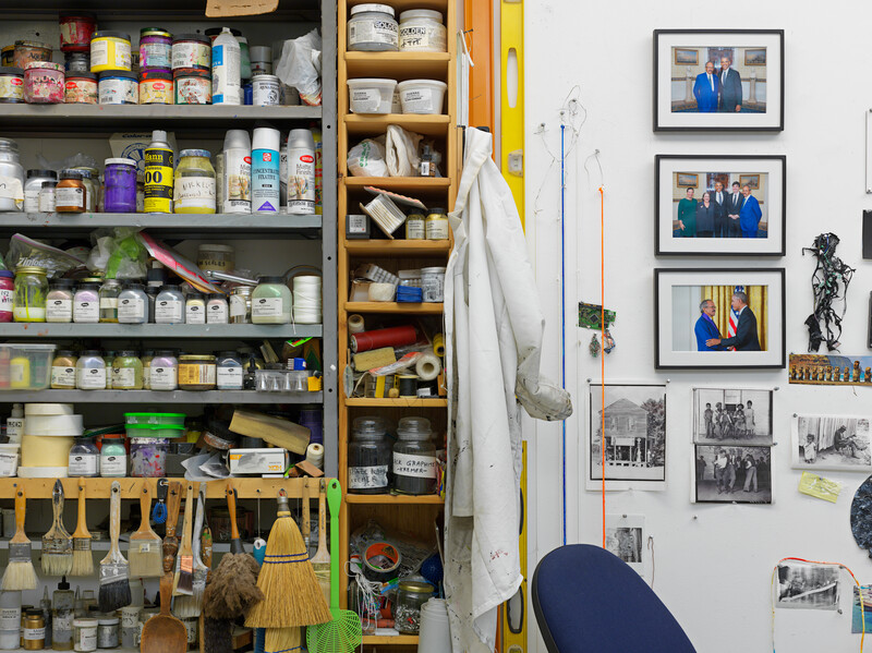
Jack Whitten’s New York studio, 2019. Photo: Genevieve Hanson
One of those student-dealers, Roger Carmona, now the store’s manager, told me: ‘Jack was one of the artists who has probably tried the most of our products here. I spoke to him a week before he passed, and he asked me about this aluminum powder and these mica pigments he had been trying over the last five years; he was experimenting a lot with light. He’d always been interested in this idea of how you can capture light with expressionism, and he was essentially using these pearlescent pigments to achieve this mimicry of transition.’
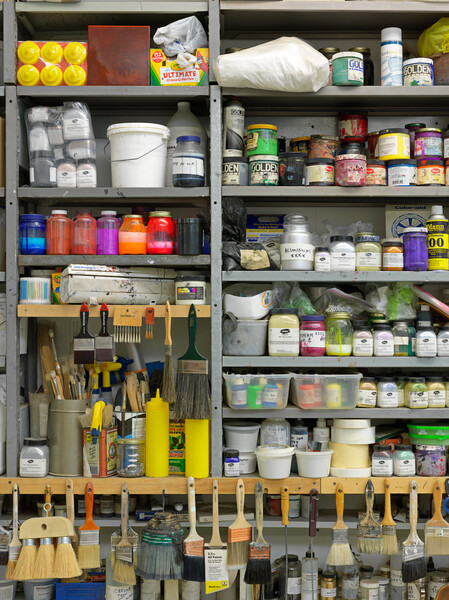
The walls behind Carmona were lined like a medieval apothecary’s shop, with bottles of the colored, crushed powders of hundreds of stones and singular bits of earth—a tantalizing display of rose madder, ratanhia root, ripe buckthorn berries, crushed diamonds, precious lapis lazuli from Afghanistan, green earth from Bavaria, ocher from Morocco—all of it an uncanny testament to the ways in which a chemist from a German village happened to make an unlikely impact on a devoted group of contemporary artists.
In the early 1970s, Kremer, then a student at the University of Tübingen, was approached by a conservator friend who was restoring the ceiling of a church in England. The particular blue that his friend needed had been favored by 16th- and 17th-century painters to render skies and mountains; in some of his early paintings, Vermeer used it for layering and to add tone. But the color had become unavailable by 1910. In Kremer’s quest to reproduce it for his friend, the young chemist created what would become the first Kremer pigment—smalt, a vivid blue made from glassy cobalt.
‘The availability of some pigments and the introduction of others has helped to shape the history of art,’ Kassia St. Clair writes in her 2016 study The Secret History of Color. The earliest pigment palettes, such as those seen on the walls of the Lascaux caves in France, fell into the limited range of materials readiest at hand—charcoal from ash, brown from the earth. In 2011, archaeologists working in a South African cave discovered evidence of a 100,000-year-old pigment-making workshop whose artisans used stones to grind colorful dirt, to which they added charcoal and bone marrow as a binder. The result was ocher, one of the earliest pigments made by humans. Over time, varied pigments would enter the language of art via exotic minerals and earths, influenced by early alchemists and, in time, propelled by colormen who traveled the world, producing and trading rare pigments, a fantastically variegated marketplace.
At [Harvey] Quaytman’s invitation, Kremer flew to New York in October 1986 bearing a custom-made aluminum suitcase outfitted with compartments; it could hold about 300 pigments—the ‘magic box,’ as he called it.
‘After the world wars, the industry took over,’ Kremer told me solemnly in a recent interview. ‘They promoted ready-made paints in tubes.’ They were colors painters could count on. But what of all the other colors that were disappearing, or the artists who wanted to manipulate and alter their own?
Finding time away from his day job, Kremer moonlighted as a colorman, studying and experimenting, developing the idea of turning his love of rare colors into a business. By the early ’80s, he had made several pigments of his own, and had moved his growing enterprise to the tiny village of Aichstetten in southern Germany, where he converted the former flour mill in which his pigments are still produced today.
The business might have remained in operation solely in the service of conservators and others in academic need of hues once used by long-gone artists. But in the 1980s, in New York and Europe, something surprising was beginning to happen in the world of living artists: painting, which Conceptualism and certain critics had pronounced historically dead, or at least terminally moribund, was rising from its shallow ashes and propelling a new generation of painters, along with those in previous generations who had never abandoned it. It was a phenomenon, Kremer said, that brought him ‘into the streets,’ primarily through a connection with one highly inventive Queens-born abstract painter, Harvey Quaytman (1937–2002).
Quaytman, who would remain a Kremer customer until his death, called himself a ‘classical modernist.’ In the ’80s, using the shaped canvases that had come to define his work, he began to focus on crucifix forms and to incorporate rust into his paintings, experimenting with other materials as well. In an era dominated by the sleek, recycled mass-culture imagery of the Pictures Generation, Quaytman became part of a small but significant wave of artists whose deep interest in materiality harkened back to the mid-’50s works of Robert Rauschenberg and Jasper Johns. At Quaytman’s suggestion, Brice Marden, a friend and studio neighbor, began to mix beeswax with pigment, much as Johns had incorporated beeswax into his own paintings. Meanwhile, Quaytman had taken to the road trying to find colors that he could imagine but could not find in New York City art-supply shops, embarking on a series of pigment sourcing trips to Italy in 1982 and 1984. Not long after one of these trips, a leaflet from a manufacturer in a small German village made its way to him.
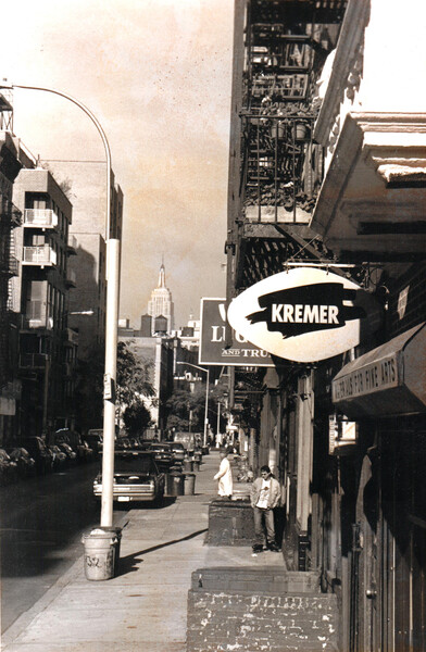
The Kremer Pigments storefront on Elizabeth Street, New York, c. 1997. Courtesy Kremer Pigments, New York
Kremer, using a reference book to look up galleries and museums, had amassed a list of addresses and sent out approximately 2,000 of these brochures, introducing the pigments to potential clients, conservators and artists. Quaytman responded, and arranged a trip to Germany. David Kremer, who now runs the day-to-day operations of the company his father founded, still remembers that first visit, in February 1986, by the enigmatic guest from the Bowery who obsessed over pigments with his father and puffed on an ever-present pipe.
At Quaytman’s invitation, Georg Kremer flew to New York in October 1986 bearing a custom-made aluminum suitcase outfitted with compartments; it could hold about 300 pigments—the ‘magic box,’ as he called it. Kremer carried the case through airport customs without incident and into a meeting with conservators at the Metropolitan Museum of Art. ‘Getting in was no problem,’ Kremer recalled. ‘There was no fear of bombs then. But getting out of the museum with this ‘magic box’ was very different.’ It took about an hour to convince security that it contained nothing ancient from the museum itself.
At the end of his stay with the Quaytmans at their home on the Bowery, Kremer left the magic box with Quaytman, who held on to it for testing. ‘I have no favorite colors, but a color must mean something to me before I use it,’ Quaytman said in 1987 in an interview with the art critic Kimmo Sarje in Helsinki. ‘I must love that color and it must strike me.…I just discovered this blue last year in Germany, and it resonates in my soul.’
Meanwhile, Kremer’s own interest in raw materials was intensifying. On holidays, he took his young children not to beaches but to museums to see exhibits by the artists he worked with and the paintings whose colors he helped preserve. Or else he drove them through remote mountains in search of Bohemian green earth or the Verona green earth of Italy, itineraries dictated by art and dirt.
The actual magic box has long since vanished, but by 1990 it metamorphosed into the first bricks-and-mortar Kremer store in New York. Located first in the East Village, and then at 228 Elizabeth Street, a short walk from the Quaytmans and a number of other artists’ studios, ‘it was like a candy store,’ said the painter Rebecca Quaytman (R.H. Quaytman), Harvey’s daughter, who continues to make significant use of the pigments she was introduced to as a child.
‘You’re creating an experience of a person, of that person transfigured by your experience of them, and you put them into paint.’—Peter Nadin
Mary Staikos Whitten, who was married to Jack for almost 50 years, told me recently: ‘It’s hard to think of Harvey Quaytman without thinking about Kremer.’ Quaytman proselytized for the pigments, introducing fellow painters like Whitten to what Kremer had cooked up. A 1994 promotional film, ‘The Colourman,’ shows Kremer strolling out of the store and down the Bowery in his hat and scarf, past the sign for the old Sunshine Hotel, next to where the New Museum now stands. In his studio, Quaytman smokes his pipe and lays out an experiment for Kremer, waiting to watch his pigment transform and turn gold. ‘He was interested in the hidden things behind the color, really,’ Kremer told me. ‘He was interested in alchemy.’
In the film, as the camera pans around the studio and out the windows over the skyline, Quaytman says, ‘My art is very architectural and architectonic, and it relates to buildings in a city, and I do also. But it’s funny with this business, with this semi-controllable or almost uncontrollable technique—you get effects that are very nature-like. All of a sudden, it doesn’t look so urban to me. It looks like the country. It makes me nervous.’
In the Elizabeth Street days, Kremer often traveled to New York from Aichstetten, making studio visits to find out what artists needed and how they were putting his materials to use. ‘At the time, I was doing paintings that were very conscious of Renaissance paintings,’ Brice Marden said from his studio in Tivoli, New York, where he was preparing work for a new exhibition. Kremer once brought him a small bit of lapis lazuli in a jar, ‘which I still have,’ he said. He gravitated to using Kremer inks, which he applies using wooden sticks in large-scale, calligraphic drawings. ‘Over the years, you become familiar with their ways,’ he said of the inks. Several years ago, he even began crediting the Kremer materials in his titles, for the benefit of future conservators.
For artists with such intense devotion to particular effects, the pigments offered an unmatched degree of freedom and malleability in the mixing. ‘It’s like being able to make a menu from scratch,’ Kremer said. One of the first pigments that painters clamored for was green earth. ‘It’s not easily found in the ready-mades,’ he said. ‘It doesn’t behave nicely in the tubes. It’s like a bad guy. But artists want it because it’s important in painting the skin of people, all people. For Caucasian skin, you want green earth, a little red on top, a little white. For brown skin, it’s important too. The green underneath gives it a depth. In Europe, artists were saying there was no green on the market, so I needed to find it myself.’

Still from ‘The Colourman,’ 1995. Harvey Quaytman and Georg Kremer testing pigments in the artist’s studio. Courtesy Deutsche Welle Television
Green earth pigments are essential for the artist Peter Nadin, whose studio sits on a hill above the farm he operates with his wife in the northern Catskills. ‘Essentially, when I paint a portrait, I am making skin,’ he said recently in the garden behind the West Village house where he lives. ‘You’re creating an experience of a person, of that person transfigured by your experience of them, and you put them into paint. The point of pigments for me is not they become a fetish but a way to be able to get what you need.’
Today, Kremer’s U.S. outpost operates on 29th Street near Eighth Avenue, having followed galleries and artists’ studios in their migration to Chelsea; 2020 will mark the store’s 30th anniversary. Its current inventory offers more than 700 pigments, both organic and synthetic, along with binders, brushes and dyes. Conservators and industrial clients continue to come in, along with fashion designers and unusual customers like violin makers (who swear that a certain gold-yellow pigment improves the resonant qualities of wood), but the bulk of the business, David Kremer said, remains artists.
Carmona told me that as long as the company has a raw source for a pigment, it can continue to make it. But colors disappear for many reasons, some of them carcinogenic ones. Emerald green pigment was outlawed in the ’90s because it contained a significant amount of arsenic. Ultramarine green briefly appeared as a sort of fluke, a byproduct of ultramarine blue, and then disappeared. For a time, it was impossible to get mallow blossoms from Sudan, for instance, because of an embargo. Recently, because of the U.S.-Chinese trade war, tariffs have become prohibitively high on certain products, like a particularly coveted strength of cowhide glue. In ‘The Colourman,’Harvey Quaytman says: ‘I learned more about history and geography from [Georg Kremer] than I did from anyone else.’
Over the years, artists have approached the Kremers with special requests and highly specific geographic needs. For her earthwork-inspired series ‘Morning: Chapter 30,’ exhibited at MOCA in 2017, R.H. Quaytman sourced a large quantity of wild indigo from Kremer for 20 large panels. More recently, making new work for an upcoming show in Lodz, she wanted to paint with pigment from as close to Poland as possible; the Kremers were able to supply her with a yellow ocher from the Carpathian Mountains. ‘It’s just a very light, pale color, but I like that it comes from there,’ she said. ‘It’s just another way of making a choice.’
‘I was close with Bob Rauschenberg, and he would say, ‘We all know we’re serious by now, right? We don’t have to act like it.’ That’s how I feel about color.’—Helen Marden
Kremer has made custom pigments out of Swiss francs and, recently, for Trevor Paglen—in one of the strangest requests the company has ever fielded—a highly accurate iPhone gray. ‘An iPhone 4, I think, or an iPhone 3,’ said David Kremer. ‘It took probably two days just to crush one phone. We had to look for the plastic, look for the metal, to grind each part in different ways, to find the medium, but we did it.’ (Paglen is working with the iPhone pigment as research for an upcoming project.)
Sigmar Polke, who in his long, celebrated career worked wildly unconventional materials like arsenic, lavender oil and meteor dust into his paintings, used Kremer pigments as well, buying them from a small local reseller, Tutti Paletti, in Cologne. Violet in particular, he believed, had mystical properties. In a rare 2007 interview with Carol Vogel in ‘The New York Times,’ Polke demonstrated how he applied lacquer-soaked fabrics to his canvases, then layers of black transparent cloth. Painting with violet pigment over the top, the surfaces underwent an alchemical transformation, turning ‘gold as though they were drying against the sun.’
The director Gus Van Sant, a longtime painter who exhibited a series of large-scale watercolors at Vito Schnabel Projects this fall, painted his drifting, impressionistic scenes with Kremer premade watercolor sets, which he applied directly onto linen canvas. ‘One thing Gus’ show exhibits is the materiality of the color rather than the image of the color, how the watercolors have a certain texture, an idiosyncratic quality that’s unique to each color,’ said Carmona, who advises Van Sant when he visits the shop. ‘I think that’s what makes those paintings interesting. They almost look like frescoes in that regard.’
Helen Marden, who mixes Kremer pigment and resin for her paintings, some of which were shown last spring at Gagosian, goes for reds. She was initially attracted to the pigments primarily for the sheer saturated quality of their colors. ‘I always loved looking at the piles of paint I’d see in India and Morocco, but I like working with these,’ she said. ‘They’re made with real thought.’
Watching six paintings take on the light of the setting sun at her home in Tivoli recently, she added, ‘I think people look down on bright color. People are afraid to be serious. I don’t know if it’s leftover Puritanism or what. I was close with Bob Rauschenberg, and he would say, ‘We all know we’re serious by now, right? We don’t have to act like it.’ That’s how I feel about color.’
Jack Whitten’s New York studio, 2019. Photo: Genevieve Hanson
I asked Kremer if he believed he has had a lasting impact on the work of painters in the late 20th and early 21st centuries. He demurred, returning to the idea of the menu. ‘I can only give them what they need in order to make their work,’ he said. ‘I can get into the studio and teach the customers how to make paint, but I can’t tell them what to do with the paint. I can only give them advice on how to cook it.’ Back in Jack Whitten’s studio, dozens of jars of powdered Kremer pigments in bright pearlescent colors remain, lining his shelves just as he left them; in their midst now sit some of Whitten’s cremated ashes, in a plain brown box. ‘I put Dad with the pigments,’ Amidon said. ‘I think he’d be happy there.’
–
‘Jack Whitten. Transitional Spaces. A Drawing Survey.,’ the first major survey of Jack Whitten’s works on paper, will be on view at Hauser & Wirth New York 69th Street 28 January through 4 April 2020.
Rebecca Bengal is a fiction writer, essayist and journalist based in New York. Bengal has written for Topic, Aperture, The Guardian, Oxford American, Vogue, The Paris Review, Bookforum, Criterion Collection, and Guernica, among others. She is a MacDowell Colony fellow and will be the Mina Hohenberg Darden Visiting Professor of Creative Writing at Old Dominion University in Norfolk, Virginia in the spring of 2020.