Conversations
Günther Förg In His Own Words
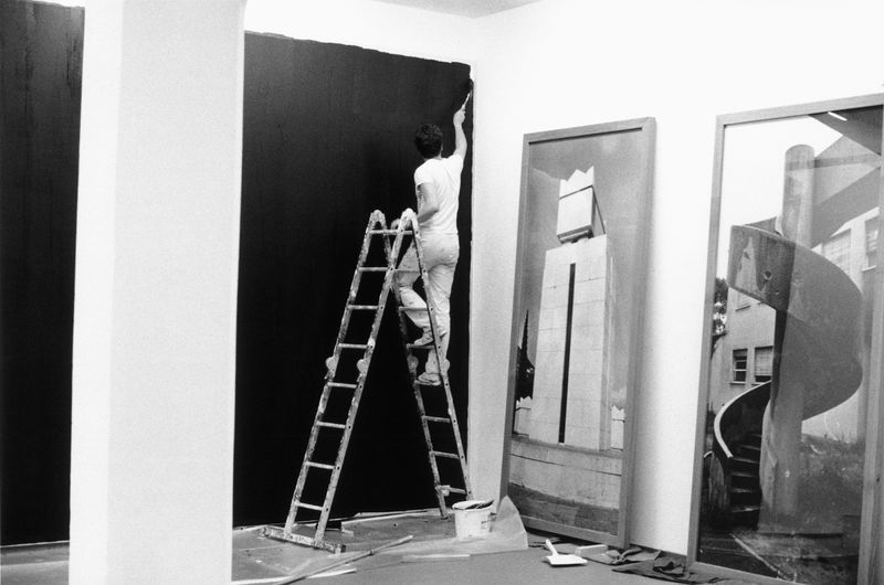
Günther Förg installing his exhibition at Galerie Hetzler, Cologne, 1983 © Wilhelm Schürmann, Herzogenrath
Below is an archival interview with the artist by art historian Dorothea Dietrich, originally published 30 years ago in The Print Collector’s Newsletter, Vol. XX No. 3, July – August 1989. In this rich discussion, a reader gains insight into Förg’s emphatic and particular thought processes, and the importance of photography, color and architecture in his work. The conversation, arranged with the help of Julie Sylvester, took place in German in New York and is translated by the author.
Dorothea Dietrich: Your first works after art school were wall paintings and installations. Did your training at the Munich Academy lead you to an investigation of impermanent forms of art? And were you influenced by Blinky Palermo?
Günther Förg: My interest in installations and wall paintings began really out of necessity: after graduating from the academy I didn't have a studio. I was therefore looking for other ways of making and showing my art. I had studied with K. F. Dahmen, an Informell painter, but he really didn't influence me. He let us pretty much do what we wanted, and that was fine with me. I painted a lot, fairly large canvases, about 3x5 meters, and even framed them, but after the academy, there was a break. I then began to do installations. The first wall paintings were really quite simple. I would divide a wall so that I would paint half of it in a certain color. I knew Palermo's work and also Sol LeWitt's wall drawings. There is surely an influence there, but it is not as strong anymore. I became more interested in easel painting again. In fact, I have distanced myself considerably from Palermo's work since then. One should, after all, look at his work the way it really was and not over interpret it just because he died at such a young age. Since 1980, in a parallel development to my wall paintings, I began to experiment with photography to be closer to reality.
DD: How do you see photography closer to reality than wall painting? Couldn't you say that wall painting is closer to reality since painting, wall, and space become one?
GF: No, I mean in comparison to easel painting.
DD: So you saw easel painting right from the beginning as a contrast? And photography as closer to wall painting than wall painting to easel painting?
GF: Yes, it is more direct. The first photos were portraits of friends, mostly of women. Then I began to make photos of architecture, photos of classical architecture.
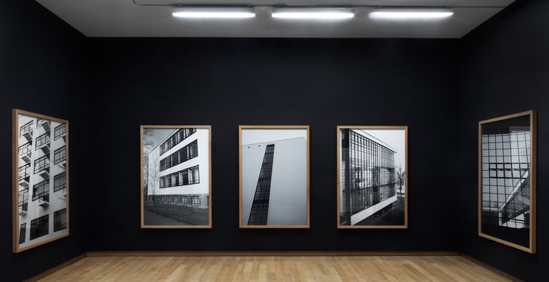
Installation view, ‘Günther Förg: A Fragile Beauty’, Stedelijk Museum, Amsterdam, 2018 © Estate Günther Förg, Suisse / VG Bild-Kunst, Bonn 2019. Photo: Gert Jan van Rooij
Günther Förg, Casa del Fascio, Como, 1995© Estate Günther Förg, Suisse / VG Bild-Kunst, Bonn 2019
DD: You photographed fascist buildings in Italy and, in your installations, frequently contrasted them with modern buildings.
GF: That came only later. At the beginning it was more the architecture of the 1930s.
DD: Why architecture of the 1930s?
GF: I was attracted to the clarity and rationality of these buildings. The paintings I made at the academy were also rational.
DD: But is this architecture not ideologically charged?
GF: No, I see this more as being reduced to its essence, stripped of all that's superfluous, much like paintings that are reduced to painting itself, to their own essence.
DD: What then about your contrasting of fascist and modern architecture in your later installations? How do you try to manipulate our understanding of architecture?
GF: That is not manipulation. What is my wall painting and how have I used it? Well, first of all to highlight a certain architecture by focusing on the walls. The architecture determines the location of the wall painting. It is a fundamental difference whether I exhibit in a loft or an Art Nouveau apartment or a Neo-Classical museum.
The frames lend the photos the character of a window. I wanted to underline the theory that a painting is like a window.
DD: How does this difference manifest itself? In the size of the installation, the choice of photographs, the colors, the other objects you may include in your exhibit?
GF: I would never make a wall painting in certain rooms. In a bad room, for example. I value my painting too much for that. Why should I support and highlight bad architecture? Art needs good architecture.
DD: Is there a reciprocal relationship between art and architecture?
GF: Yes. At the beginning, I made installations with wall paintings only; later when I began to include photographs, I had them printed relatively large so that I could link them with the wall paintings. First, I left the photos unframed, but later they had thick wooden frames.
DD: Why did you include the frames?
GF: The frames lend the photos the character of a window. I wanted to underline the theory that a painting is like a window.
DD: Don't you thus also question the normal function of a window? In your installations we frequently don't look through windows, but look at the photograph of a window or, instead of seeing the photograph, we only see another window reflected in the glass of the photograph.
GF: Since the photographs are not only framed but also glazed, the viewer becomes part of the whole. I have often observed how visitors to my installations try to find a position in which they don't have a reflection in the glass. They want to see the photo as neutrally as possible, but that is almost impossible, for one can't avoid the reflections. In many respects, the mirror represents the ideal situation in my installations as it reflects the architecture as well as the viewer but also functions as a picture.

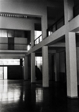
Installation view including Hans Lange, Krefeld photographs, ‘Günther Förg: A Fragile Beauty’, Stedelijk Museum, Amsterdam, 2018 © Estate Günther Förg, Suisse / VG Bild-Kunst, Bonn 2019. Photo: Gert Jan van Rooij
DD: Your work is characterized by two different modes, an anonymous, objective mode and an expressive one.
GF: I don't separate it like that. I like using different media.
DD: And you don't consciously create a polarity between an objective and an expressive mode?
GF: Well, yes, one could say quite concretely that the composition of my lead pictures is anonymous whereas the manner in which they have been painted is expressive. Or, in my freestanding sculptures I aim at an anonymous form but create an expressive surface. Even in the large photos you become conscious of the grain of the film; they become almost pointillistic.
DD: You emphasize the notion of framing in your insistence on the actual frames or the edges of a wall and by your simultaneous dissolutions of boundaries, as in the reflection in the mirrors. Are you commenting on art’s ability to make unequivocal statements?
GF: No, I don't see it like that. But that's for the critics to decide. What I like about the bronze reliefs, for example, is that they exist somewhere in a space between sculpture and painting. There are paintings by Hans von Marees where one finds a similar situation. The faces in his paintings are half plastic. I like the coexistence of different media and approaches in my work. Some works are concerned with dissolution, but there are also the reliefs and freestanding sculptures, where I have all the diversity and richness that I negate in the other works. It all belongs together, and I enjoy the possibility of going back and forth between them. Sherrie Levine’s art is pure quotation. I enjoy painting. For example, I very much like the work of Baselitz, who is interested in an abstract expressionism. People are often amazed at that, and they have accused me of having returned to traditional painting. But painting is really important. There are, of course, times when one negates that, but today I see my work as more aligned with the classical tradition in art.
DD: What values do you assign to colors?
GF: My colors don't have symbolic meaning in the sense that red is blood and black is death.
DD: You quoted the colors of the Villa Wittgenstein in your installation in the Haus Lange in Krefeld.
GF: Yes. By means of color I was able to connect the two different architectures of the Villa Wittgenstein and of the Haus Lange designed by Mies van der Rohe. Photos of the Villa Wittgenstein formed the graphic part of that exhibition, but they were now put in Mies van der Rohe's architecture. The windows in Mies’ building are placed so that they would frame perfectly the old trees in the park outside. He turned each window into a frame. I contrasted that with the vertical planes of the Villa Wittgenstein where there is absolutely no concern with the outside. Those are again the two aspects of my work: the relationship of plane to space and of interior to exterior. In addition, I transferred the color scheme of the Villa Wittgenstein to the Haus Lange and painted the supporting walls on the inside in a very pale ocher and the non-supporting walls in a pale gray. But the nuances were so subtle that only a very few people noticed it.

DD: In joining two different buildings, you annul our sense of history, space, and time.
GF: In this exhibition, I was concerned with making visible. Both houses were built at about the same time, but the Villa Wittgenstein is a city house and the Haus Lange a typical villa in a park. Yet, in spite of these differences, the architectural impetus is similar. In my installation, both architectures become almost coexistent.
DD: As one can bring different media together—photography, bronze reliefs, etc.—so one can join different architectures?
GF: The bronzes in this exhibition were conceived as an allusion to Lange's art collection. You see, Lange had built this house for his collection. My bronze reliefs stood for his collection. There are always things in an exhibition that are a result of the particular space. The Haus Lange exhibition allowed me to bring to bear all my different concerns and interests. That is not always possible. I consider the exhibition in the Kunsthalle Bern with its large Neo-Classical space equally successful.
DD: Your installations negate the singularity of historical time and space. How are we to understand your contrasting of photos of fascist architecture with modern architecture?
GF: I insist on not calling it fascist architecture but ‘rational architecture of the fascist period.’
DD: Why the insistence?
GF: Well, I have never shown propagandistic architecture. Once, students in Kassel attacked me for having photographed the Casa del Fascio. They claimed that one can-not separate the building from its history. But if the Gestapo had happened to choose the Haus Lange in Krefeld as its headquarters, it would not at all have changed the quality of the building itself. Besides, fascist architecture in Italy is different. They used the best architects, whereas in Germany one had only Mr. Speer's theater props. Adalberto Libera's famous house for Malaparte and Giuseppe Terragni's Casa del Fascio are as rational as the architecture of Mies van der Rohe or Le Corbusier or Engelmann and Wittgenstein. For me fascist architecture is non-existent. There is only propagandistic architecture, and I have never been interested in that.

Günther Förg, EUR, Rom, 1987 © Estate Günther Förg, Suisse / VG Bild-Kunst, Bonn 2019. Photo: Genevieve Hanson
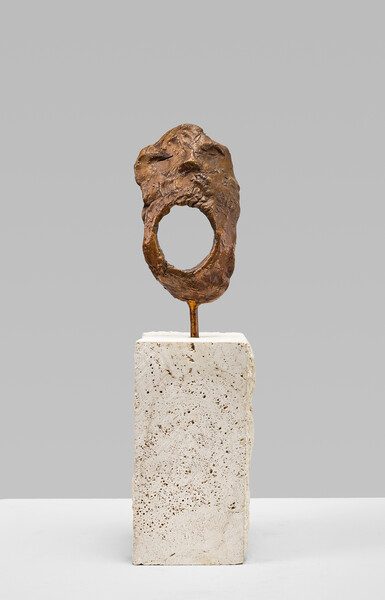
Günther Förg, Untitled (Mask), 2000 © Estate Günther Förg, Suisse / VG Bild-Kunst, Bonn 2019
DD: Do you imply a critique of fascism when you show the buildings in a state of decay and have them further dissolved in the surface reflections of mirrors and glass in your installations?
GF: No, not at all. One critic once wrote that I was critical of fascism since the perspective I chose when I photographed the Casa del Fascio suggests that the columns are collapsing. That is truly nonsense, since the issues are on a totally different plane.
DD: Your work revolves around installations. One could ascribe a political motivation to your avoidance of the commodification of the work of art. Do these concerns inform your graphic works?
GF: No. The affordability of prints is purely a by-product of the process. I am interested in the medium and its possibilities.
DD: You have issued editions of photos, lithographs, etchings, and, recently, also mono-types. Do you print these works yourself?
GF: For my nongraphic work—lead paintings, for example—I use assistants. They do the preliminary work since I can't do it all myself. I rather like that. With my graphic work it is even more extreme. I have absolutely no interest in doing the printing myself. I collaborate with a good lithographer or printmaker who brings his own expertise to the process. You see, at the academy I didn't really learn the technical processes. When in 1984 I began to make lithographs, it was a totally new experience for me. Similarly, when Julie Sylvester encouraged me to make monotypes—I had done earlier editions with her—I thought it was an awful suggestion. Monotypes reminded me of high school. But I was getting tired of the technical aspects of etchings and lithographs and finally agreed to making monotypes. I like to do things quickly and in a concentrated manner. One can't spend months on a project. I like to prepare everything as carefully as I can, so that I can immerse myself in the work. I completed the work on the series of 54 monotypes in an edition of three in two days. I printed with Maurice Sanchez in New York and learned a great deal from him.
I like to work in different media at the same time... One has to give oneself the chance to develop and not allow anything to wither.
DD: Do you experiment with new methods?
GF: No, I am a classicist at heart. I want to use a medium in the best manner possible. I think that the making of very large woodcuts, for example, is not the best possible use of the medium. Since one cannot get a perfect print, the whole block has to be printed by hand. That doesn't speak against the quality of, say, Baselitz' large woodcuts, but I seek a tighter quality control. That is also why I keep my editions small, usually only about 20 prints. For a large work I would rather make a drawing than a print. I am not that keen on becoming an entry in the Guinness Book of World Records; however, one of the editions I made with Julie Sylvester is quite unusual. It consists of four lithographs and one bronze relief where the structure of the prints becomes three-dimensional in the relief and the color of the prints is derived from the relief.
DD: You told me that you are now working on plans to make 14 bronze reliefs—the Stations of the Cross—as well as a book for a church in Chicago. Is it difficult for you to work on a religious subject matter?
GF: It is a terrific challenge. I have tried to read up on the meaning of the Stations of the Cross and on Barnett Newman’s series, as well as Chagall's and Rothko's work. The various solutions fascinate me, and above all the intermingling of the expressive and the rational. The monotypes I just finished in New York really developed into studies for the reliefs, although they were conceived as a separate project. I like to work in different media at the same time. I am seeing more and more that we were wrong in art school when we thought that one’s life had to reflect one’s artistic practice, that you could only make Minimalist works if you also adopted a Minimalist lifestyle, lived like a monk. Otherwise the art would not be true. But that is an error. One has to give oneself the chance to develop and not allow anything to wither.
Dorothea Dietrich is an art historian and author of ‘The Collages of Kurt Schwitters: Tradition and Innovation’ and ‘German Drawings of the 60s’. ‘Günther Förg. the surface of bronze’ is on view at Hauser & Wirth Zürich 13 March – 23 May 2020.